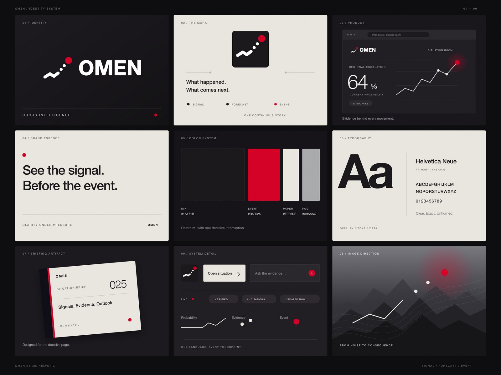
Tokens
Colours, type, spacing and motion as named values.
Colour and type tokens, components and usage rules, so every new page, post and deck stays on brand.
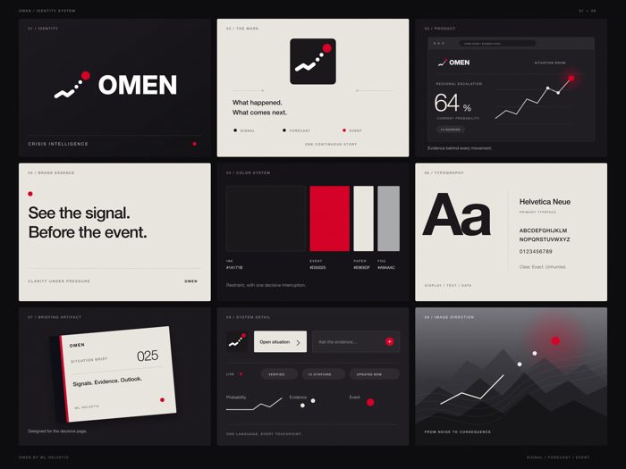 Tokens
 Components
 Content rules
 Templates
 Documentation
 Audits
Without a system, each designer, developer and agency drifts a little. A design system writes the decisions down once, as tokens and components everyone uses.
Colours, type, spacing and motion as named values.
Buttons, cards, forms and navigation, designed and built.
Voice, tone and words to use and avoid.
Pages, posts and slides built from the system.
A guide designers and developers both read.
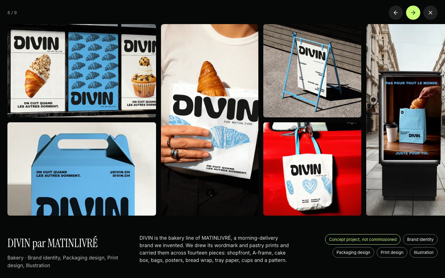
What already exists, measured and cleaned up.
Libraries with variables and components.
CSS tokens and React components.
Masters for decks.
Templates for posts and stories.
Styles for documents.
The public version for partners.
One team from the brief to the files, and you see the look before the volume.
A short call and a written brief: audience, goal, formats, dates and budget.
We make one finished piece and you judge it before the rest is produced.
The full set, in every size and language the brief asks for.
Every word read, every frame inspected at 100%, before you see it.
Files named and ready to publish; we plan the next round from the results.
Yes: we audit what exists and turn it into a system.
Yes, as CSS tokens and React components, or for your stack.
We document how to extend it; we can also keep it for you.
No: the same tokens drive decks, social templates and print.
 Video productionBrand films, explainers, social videos and animated series, from script to final mix.
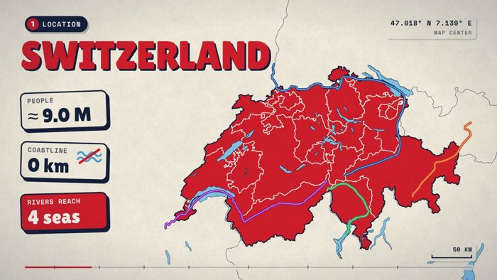 Motion designAnimated maps, data, titles and logo motion.
 Email creationNewsletters and campaign emails that render everywhere.Web designWebsites and landing pages, designed and built.Product designInterfaces, dashboards and control rooms people understand.
 CopywritingLines, scripts and pages in French, German and English.
Tell us what you need. We’ll come back with how we would make it.